
Rust Belt Nation is an apparel company based in Camden, New Jersey, focused on celebrating the history and culture of the Rust Belt. The team at Kworq developed the branding and launch strategy for the company, building around their ethos of uplifting local communities and telling the story of the Rust Belt revitalization.
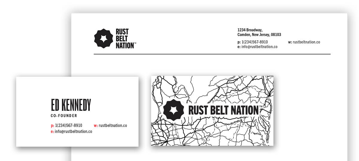
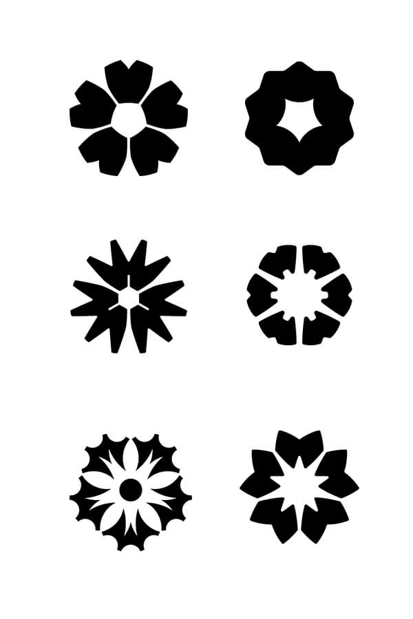
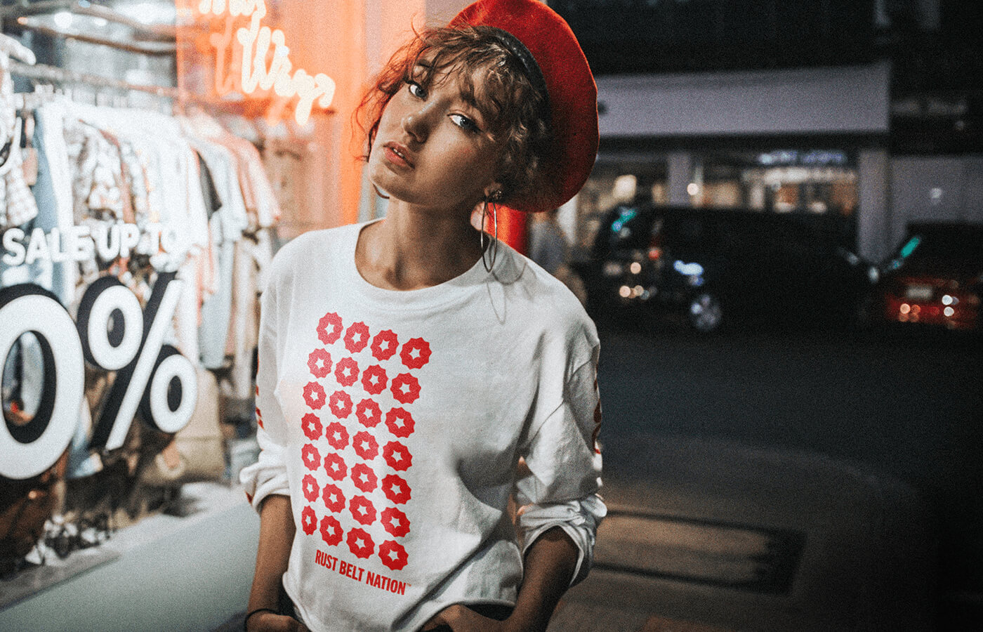
The Rust Belt Nation mark is a fusion of a mechanical gear and a New Jersey violet, representing the region’s industrial past transforming into its blossoming future. The logo is designed to be easily recognizable, and compact enough to be effectively used in a variety of sizes and mediums.
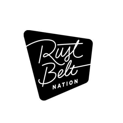
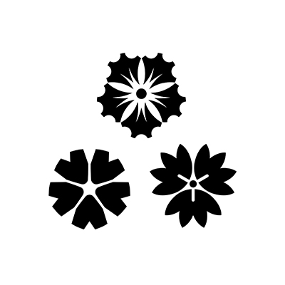
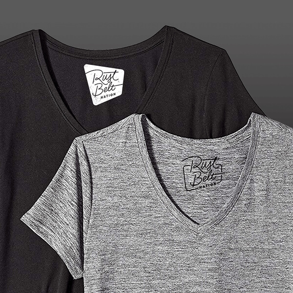
After an initial research and design phase, we presented three different design directions for the Rust Belt Nation brand. First was a neon-inspired lettered logo, evoking the aesthetic of the Rust Belt diner. Second was a combination of a gear and a flower, working off of the client’s initial idea for a gear-based logo. Third was a “flag”, a simple treatment meant to emphasize the sharp rebelliousness of the brand name.
Kworq and Rust Belt Nation agreed that the floral logo best summarized the values of the brand. The idea was further refined into another set of variations for the client, and we found the simplest version to be the most compelling.
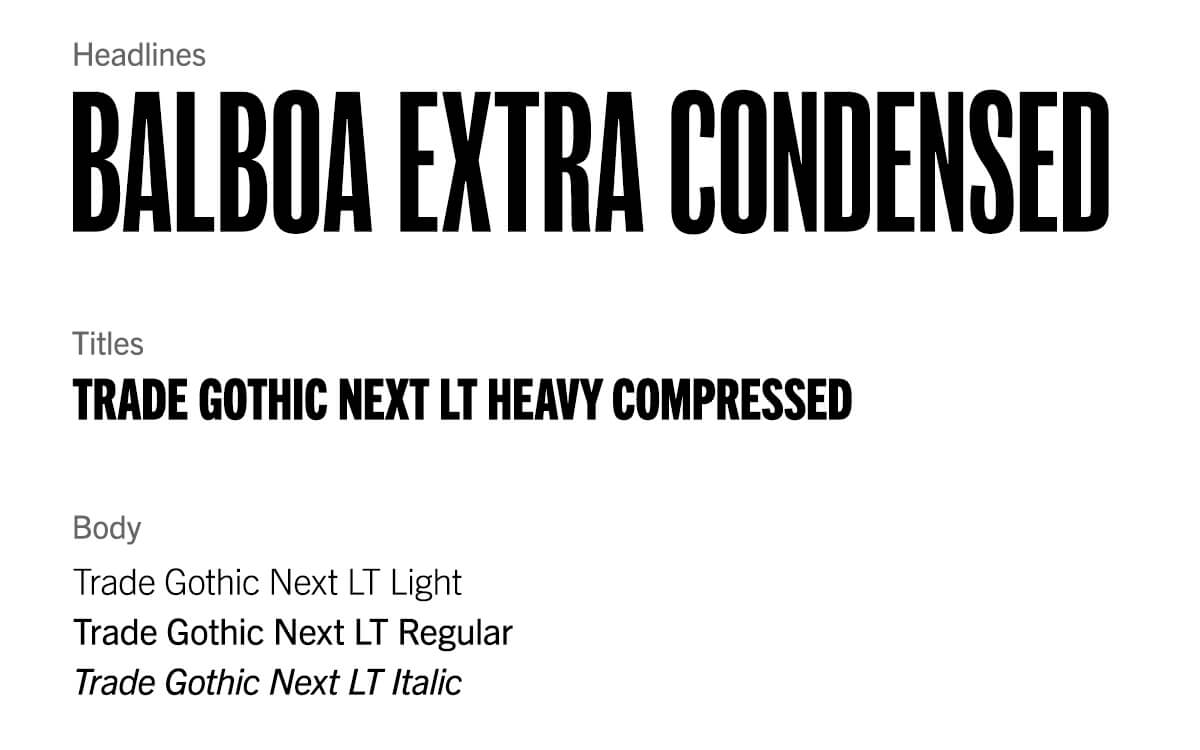
Rust Belt Nation uses Trade Gothic as its primary font, and the extra-narrow Balboa for titles. Both font families have origins in early 20th-century America. While they have the mechanical sharpness and legibility of fonts such as Helvetica or Futura, they also carry many distinctive pre-digital peculiarities, and these “imperfections” ultimately make them truly American.
The simplicity and flexibility of the logo allows for some creative uses, making opportunities for more distinctive applications of the brand. For example, to further emphasize the mission of the brand to reclaim the Rust Belt pejorative and transform it, the logo can be used as an asterisk after unflattering adjectives, reinterpreting them into something to be worn with pride.
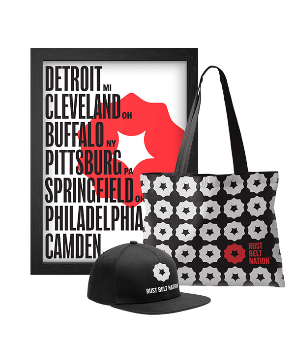
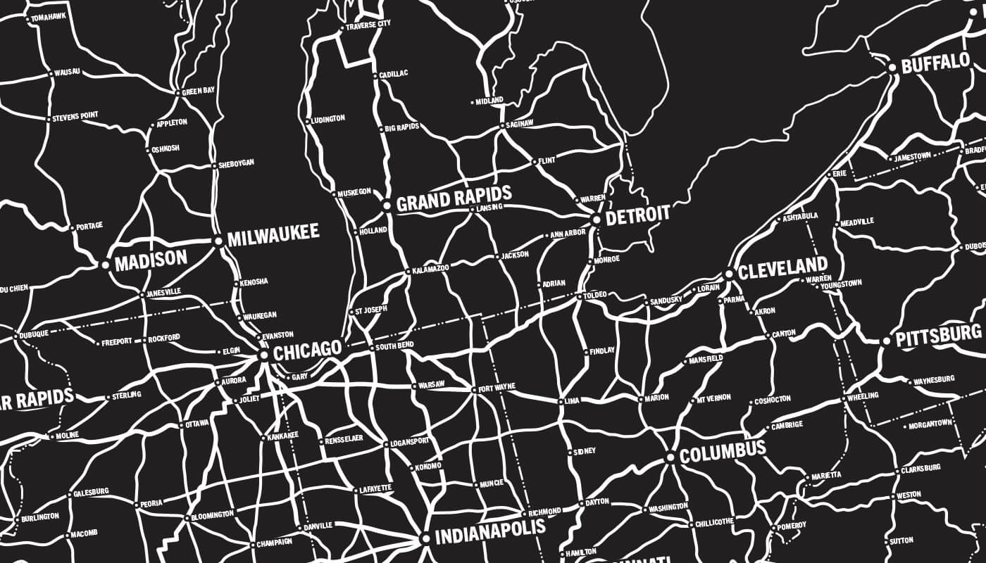
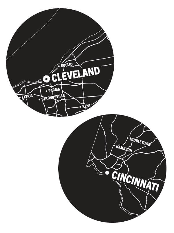
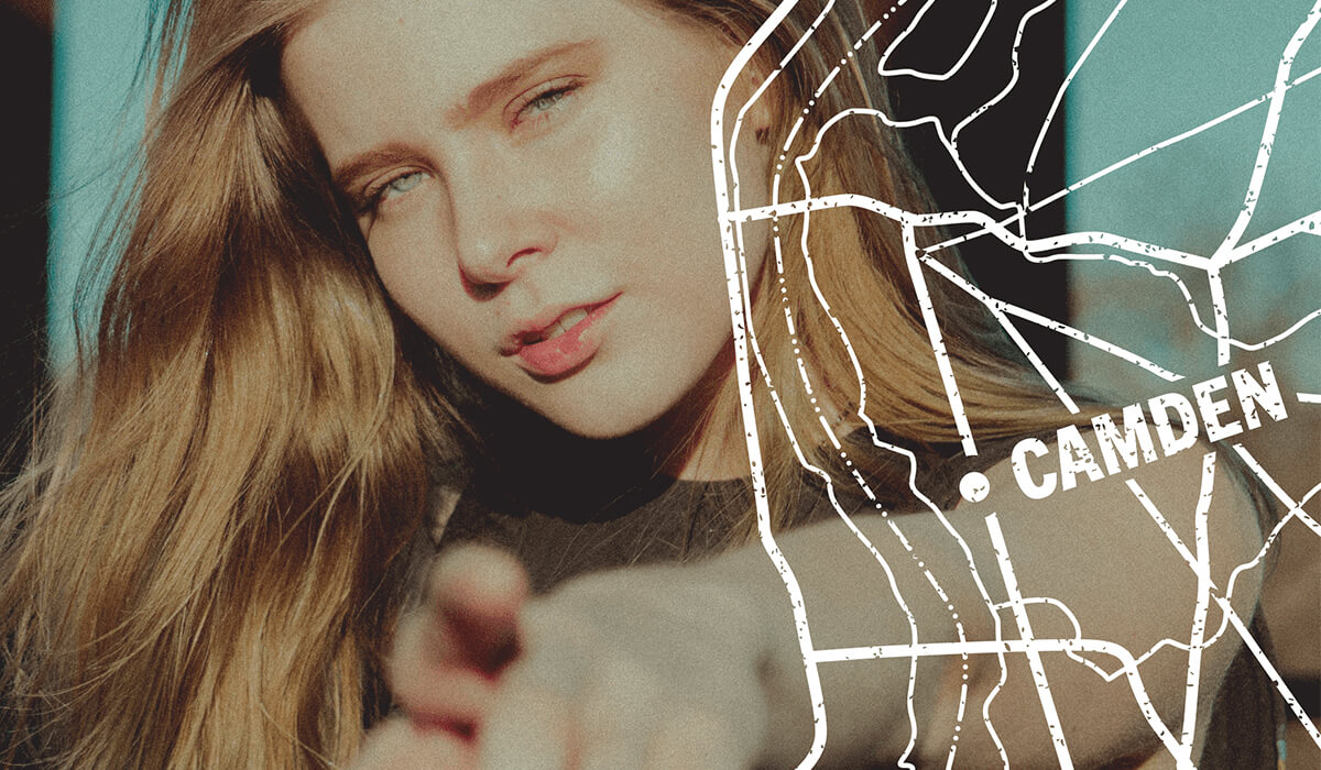
American highway maps are storytelling devices in and of themselves, documenting the growth of cities and communities alongside the network of infrastructure connecting them. We utilized the aesthetic of vintage maps as a secondary visual component to the Rust Belt Nation branding, as both overlays for photos or as standalone graphics.
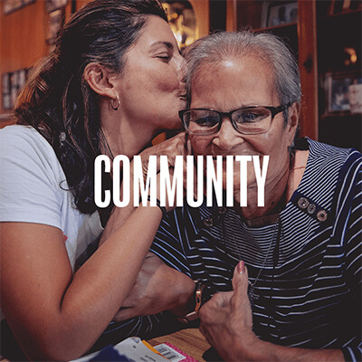
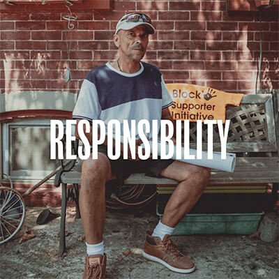
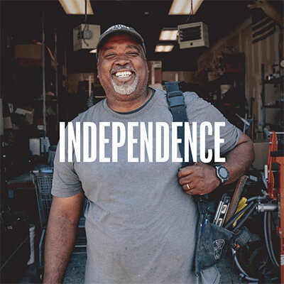
The brand was launched with a social media campaign preceding their first product announcements. Using the stark colors of the branding and the rebelliousness of the brand voice, Kworq created a set of posts which would introduce the audience to the brand’s story and values.
